
Keith A. Herman is a private wealth attorney and a certified nutrition coach. He had an existing website, but it lacked modern appeal, clear navigation, and effective branding. The website was outdated in design, had an inefficient structure, and was not optimized for search engines or user experience. To make his online presence strong, Keith approached us for a complete redesign of his website to make it more visually appealing.
Our mission was to transform his old website into a polished, high-performing platform where he could effectively showcase his achievements and expertise. The new website not only improved its aesthetic but also ensured better organization and a faster loading speed.
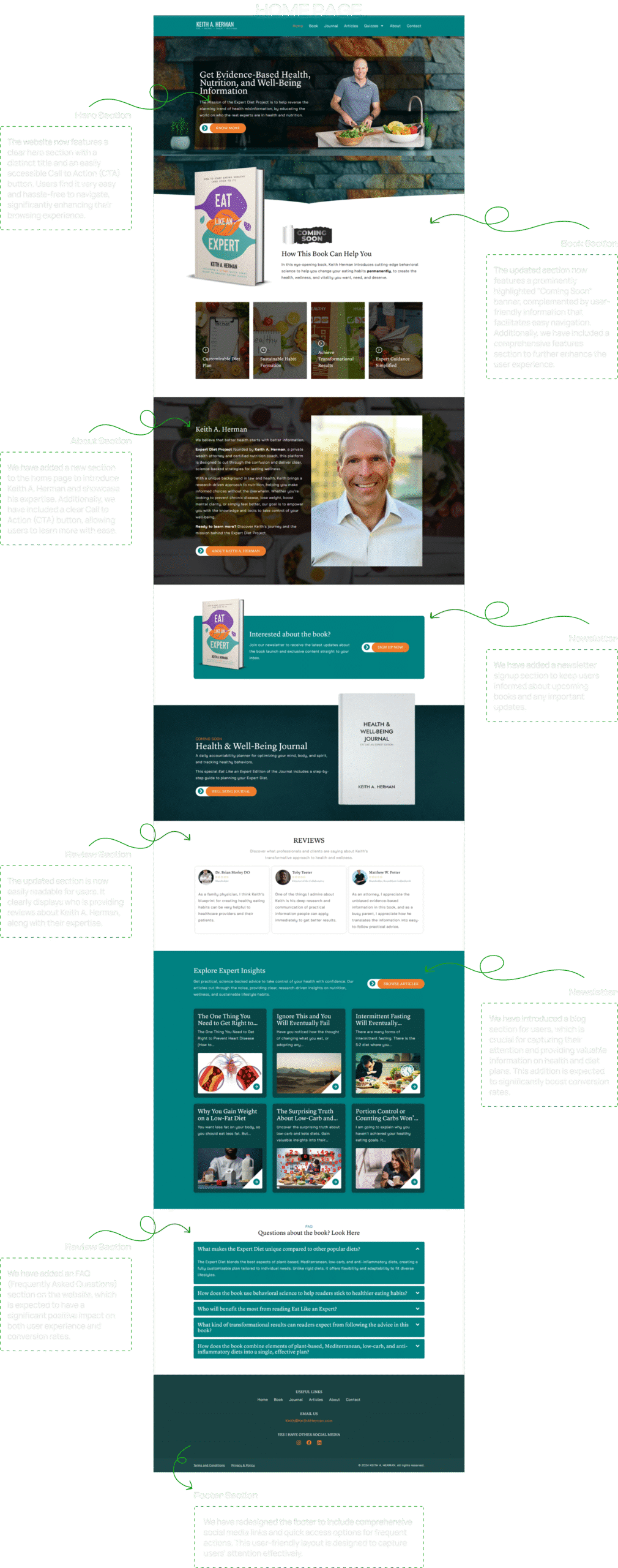
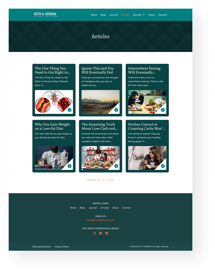
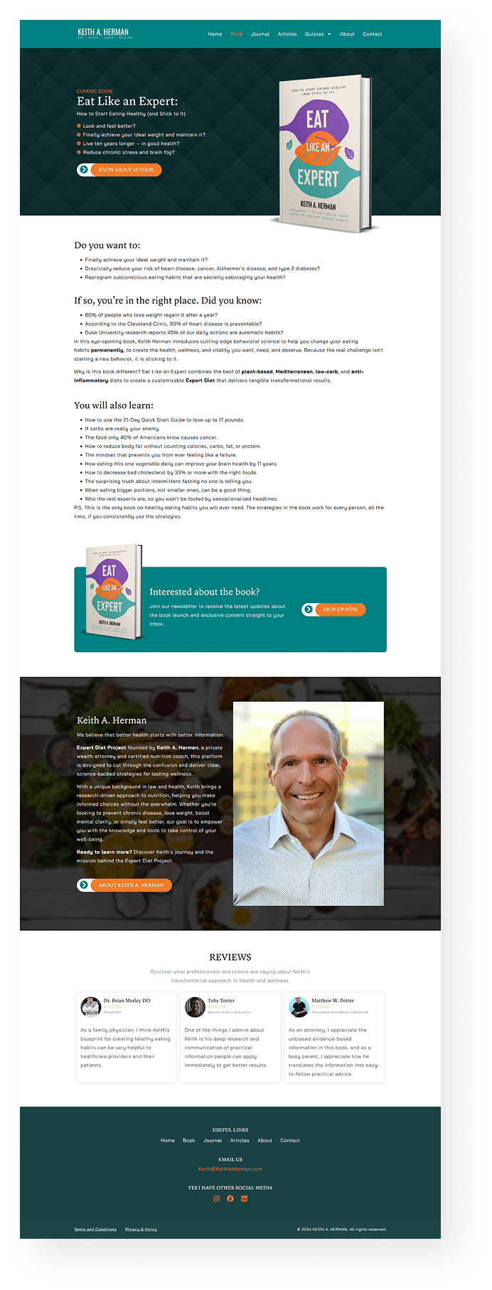
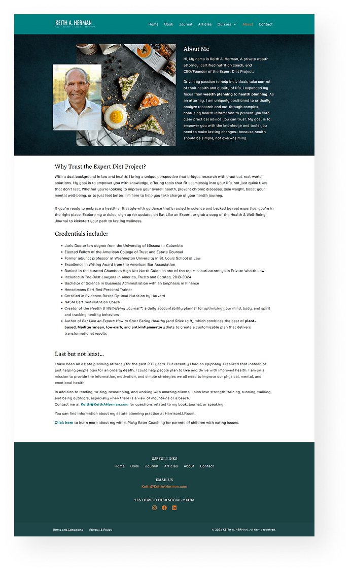
Additionally, we added new sections to further enhance user engagement, including a hero section, an improved book section, an about section, a newsletter feature, an FAQs section, and an upgraded review section.
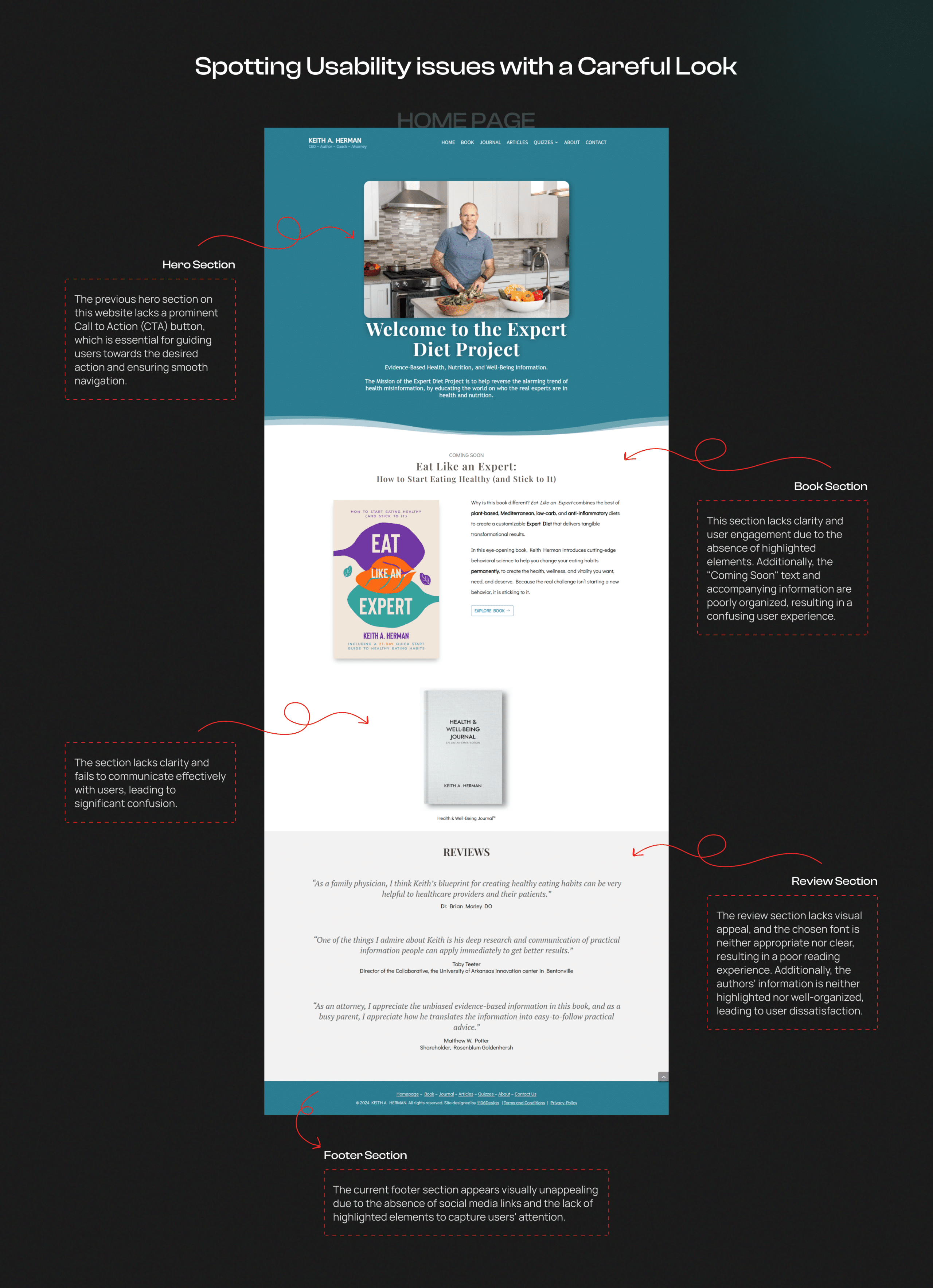
Before the redesign, Keith A. Herman’s website faced several issues that were severely affecting his online presence and user engagement:
Unappealing & Outdated Design: The old website had an outdated look that did not match Keith’s profession and wasn’t even appealing.
Confusing Navigation: Users faced problems finding important information and explored Keith’s advice.
Lack of Structured Content: The contents of Keith’s old website were not organized properly.
Limited SEO Optimization: The old website was not optimized for search engines.
Slow Loading Speed: The old site took too long to load, leading to frustration and a higher bounce rate.
Keith A. Herman serves those who are looking for nutrition expertise and guidance from a certified nutrition coach.
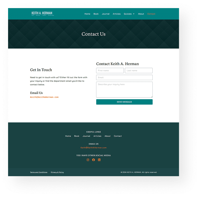
The newly designed website includes the following features:

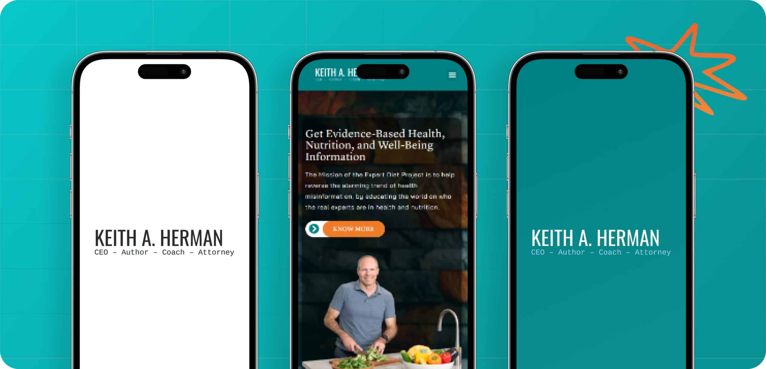

Bold geometric headings convey confidence and trust, while sans-serif body text ensures readability. This clean typography enhances the modern, minimalist, and structured design.


Blue and white create a professional, trustworthy look, ideal for health and nutrition. Orange highlights key actions, ensuring clear navigation, while white space and black text maintain a modern, uncluttered look for readability and engagement.


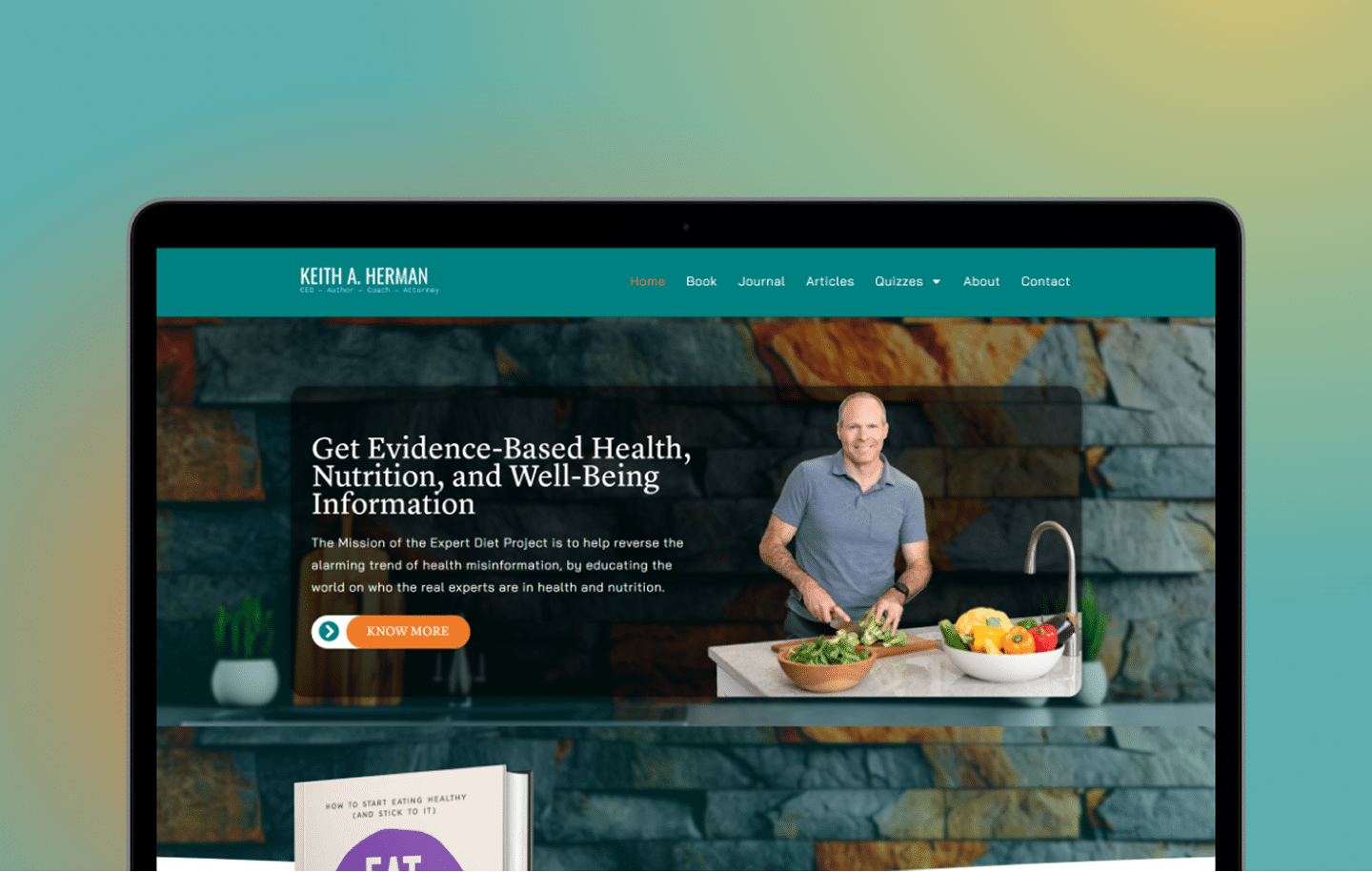
We redesigned Keith A. Herman’s website through a strategic approach: auditing the existing site, creating a modern UI/UX design, optimizing content, improving SEO, ensuring fast performance, and thorough testing. Post-launch, we provided 15 days of complimentary support for any issues or fixes.



Working with SolverDesk was amazing. They understood my vision and created a stunning, user-friendly website for Keith A. Herman’s redesign. From design to secure payments, every detail was handled seamlessly. I’m proud of the result and couldn’t have asked for a better partner to bring it to life.
Founder of Health & Well Being Journal